Color grading is one of the most creative stages of photo editing. While basic color correction focuses on making colors look accurate, color grading is about creating a particular mood, atmosphere, or visual identity. A photograph can feel warm and inviting, cool and dramatic, bright and energetic, or soft and peaceful depending on how its colors are treated.
Good color grading does not necessarily require dramatic changes. Small adjustments to temperature, contrast, shadows, highlights, and individual colors can completely change how an image feels while keeping the original photograph natural.
Correct the Image Before Color Grading
Before creating a specific look, correct major problems in the original photograph. Check exposure, white balance, highlights, shadows, and contrast first.
For example, if an image has an unwanted yellow cast from indoor lighting, adding another creative color effect before correcting it can make the final result difficult to control. Establishing a balanced starting point gives you more freedom during creative editing.
Try to preserve details in both bright and dark areas. Once highlights become completely white or shadows become extremely dark, recovering useful information can become difficult.
Choose a Mood for the Photo
Every image does not need the same color style. The subject, environment, lighting, and purpose of the photograph should influence the final look.
Warm tones often work well for portraits, sunsets, celebrations, and lifestyle photographs. Cooler colors can suit architecture, rainy scenes, city photography, or images intended to create a calm atmosphere.
Bright colors may work well for energetic content, while muted tones can create a softer appearance.
Deciding on the mood before adjusting individual colors helps keep the editing process focused.
Balance Temperature and Tint
Temperature controls whether an image appears warmer or cooler. Increasing warmth can introduce more yellow and orange tones, while moving in the opposite direction can create a cooler appearance.
Tint helps balance green and magenta tones. Small tint adjustments can be particularly useful for correcting unusual colors caused by artificial lighting.
These controls can also be used creatively after the original white balance has been corrected. A slightly warmer image may feel more inviting, while a cooler grade can create a different visual atmosphere.
Avoid extreme adjustments unless they are intentionally part of the creative style.
Control Individual Colors
One of the most useful techniques in color grading is adjusting specific colors instead of changing the entire photograph.
Many editing tools allow control over hue, saturation, and brightness for individual color ranges. This means blue skies can be adjusted without heavily affecting green trees, while orange tones can be refined separately in portraits.
For example, reducing the saturation of background greens may help a person stand out in an outdoor portrait. Darkening blue tones can add depth to a sky, while adjusting warm colors can influence the overall feeling of a sunset.
Selective editing provides much more control than simply increasing global saturation.
Protect Natural Skin Tones
When editing portraits, skin color deserves special attention. A creative grade may look beautiful across the background but cause the person’s face to appear overly orange, red, green, or pale.
After making major color adjustments, zoom in and examine the skin separately. Local adjustments or selective color tools can help maintain natural-looking tones while preserving the overall style.
It is also useful to compare the edited image with the original periodically. After looking at heavily graded colors for several minutes, the eyes can become accustomed to them, making excessive adjustments harder to notice.
Use Shadows and Highlights Creatively
Color grading can treat shadows and highlights differently. Adding a subtle tone to darker areas while using another tone in brighter areas can create additional depth.
For instance, cooler shadows combined with slightly warmer highlights can produce visual separation between different parts of an image.
The effect should usually remain subtle. Strong color shifts in shadows and highlights can quickly overpower the subject.
Midtones are also important because they often contain faces, clothing, buildings, and other major elements. Keeping midtones balanced can help maintain a natural foundation.
Build Contrast Carefully
Contrast influences the intensity of a color grade. Deeper shadows and brighter highlights can produce a dramatic appearance, while softer contrast can create a gentle or faded look.
Instead of relying only on a single contrast slider, editors can adjust highlights, shadows, whites, and darker tones separately. This provides greater control over the final result.
Be careful not to lose important details. Strong contrast may look impressive at first, but crushed shadows and overly bright highlights can reduce the quality of the image.
Create Consistency Across Multiple Photos
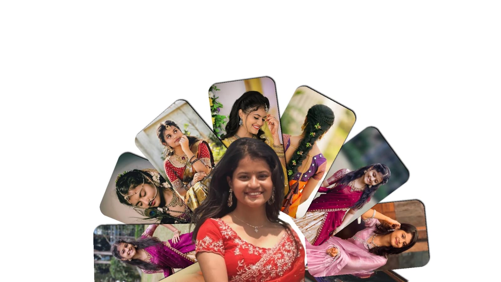
A consistent color style is useful when preparing images for a portfolio, blog, social media page, event collection, or brand.
Using similar temperature, contrast, saturation, and tonal adjustments can make different photographs feel connected.
Presets can help establish a starting point, especially when editing many images from the same session. However, each photograph may require individual corrections because lighting and exposure can change between shots.
Consistency means maintaining a similar visual character rather than applying identical settings to every image.
Review Before Exporting
After completing the color grade, view the photograph at different sizes. Zoom in to inspect details, then view the entire image to evaluate the overall balance.
Check whether skin tones remain natural, important details are visible, and no single color has become unnecessarily dominant.
Taking a brief break before the final review can also help you notice adjustments that may have become too strong during a long editing session.
Color grading gives editors the ability to shape the mood and personality of a photograph. By combining balanced exposure, selective color adjustments, controlled contrast, and careful treatment of shadows and highlights, an ordinary image can gain a distinctive visual character.
The strongest color grades support the subject rather than compete with it. Start with a properly corrected image, choose a clear mood, make gradual adjustments, and protect important natural colors.
With practice, color grading becomes more than changing colors. It becomes a creative way to establish atmosphere, consistency, and a recognizable editing style across your photographs.
Full Project
XML file
Song link