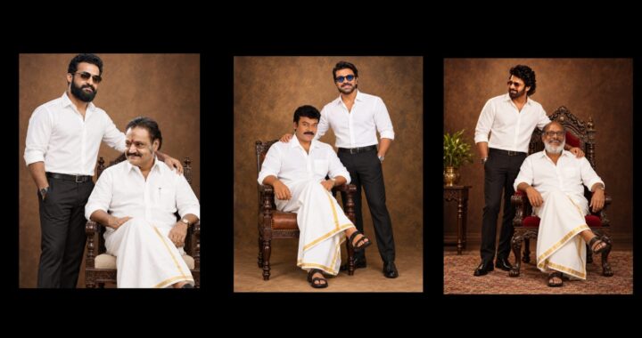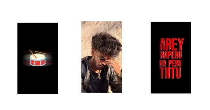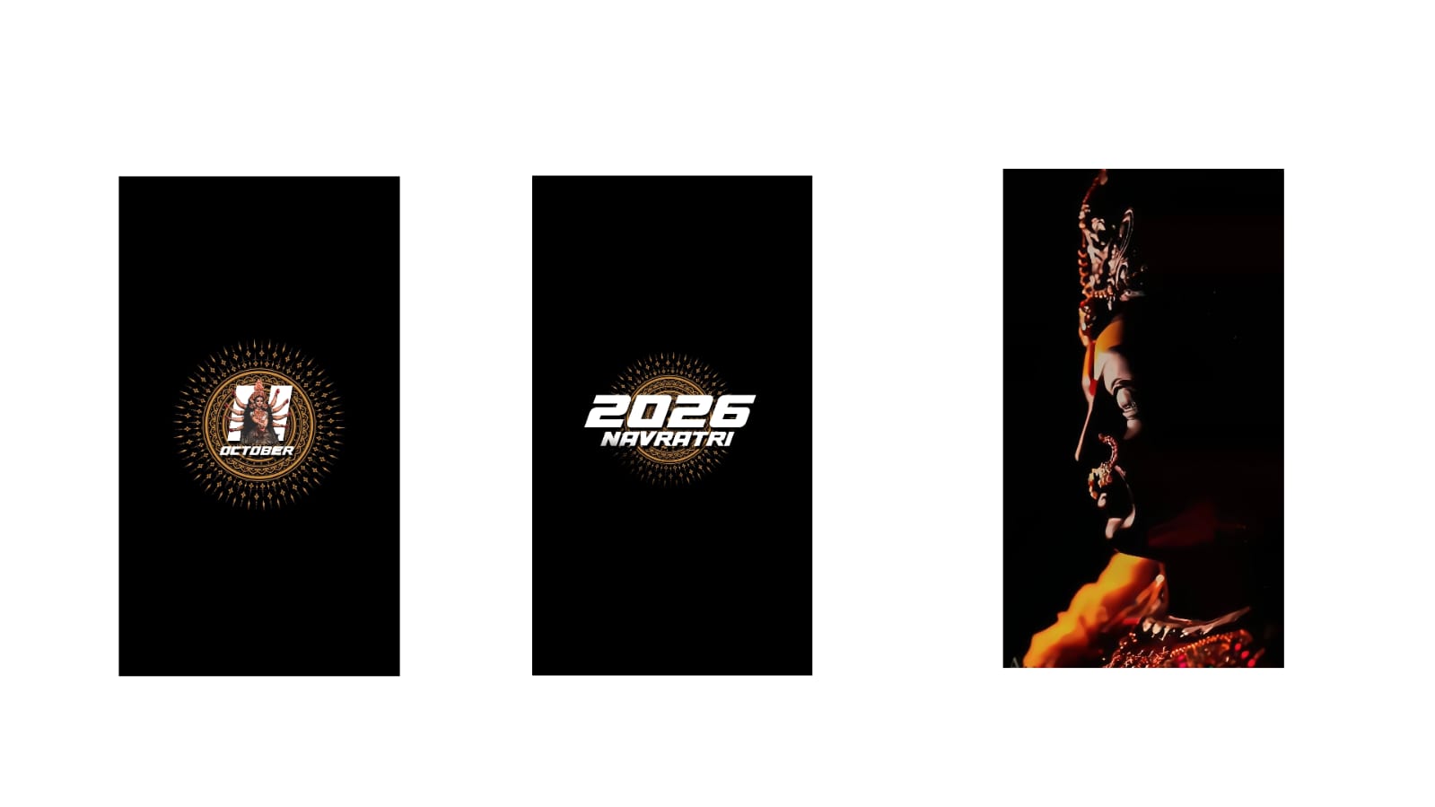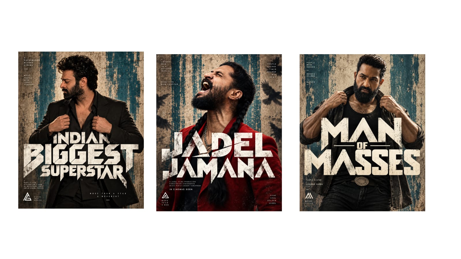
Since yesterday, many people have sent me this video and asked me to show how to recreate this style using Alight Motion. However, this video was originally created in After Effects. But don’t worry, you can easily replicate it in Alight Motion as well—it is not a big deal. Let me show you the video I made here so you can check it out.
This is the full video I created in Alight Motion, and I think it turned out quite well. I even added a few extra elements, animations, and 3D effects right at the end. It looks great, so let us try to break down how to do this as simply as possible. Keep in mind that there are a few subtle differences between After Effects and Premiere Pro, so please pay close attention to those variations as you work.
I will be focusing on the project breakdown in this video rather than building it completely from scratch, as a step-by-step recreation might become a bit tedious and boring to watch. If you lack the patience to build it all yourself, I have provided the project file link in the description for you to download and use. Instead, I will give you a clear conceptual walkthrough of how I achieved the final result. While I plan to upload full, detailed tutorials starting from the next video, I felt a complete step-by-step explanation here might feel repetitive, which is why I am keeping this breakdown brief.
First, please note that your mobile device is highly likely to lag while editing this project, as I experienced a significant amount of lagging myself during the process. To manage this, I divided the entire workflow into two separate projects. The first project we need to look at is the main one you saw on screen, so let us open that up. Inside this project, I utilized a camera layer; however, that will only come into play later on, so you do not need to worry about it just yet.
As I mentioned earlier, I am sharing a structured breakdown instead of starting from absolute scratch because the foundational steps are actually quite simple. Once you learn how to handle one or two layers—similar to creating a pre-composition in After Effects—you have essentially mastered the process for the entire video, making the rest of the project very straightforward. Let us look at the layers from the bottom up. For the base structure, I built everything using Null objects to control the elements.
As for the second part of the project, it features a golden-themed visual that appears right at the end, and that is the specific section where I utilized the camera layer. Moving up from the bottom of the timeline, I first added the background layer and then overlayed a brush stroke video on top of it. For the background itself, I applied a gradient image effect. You can easily customize this by choosing any gradient palette or specific colors that best match your personal style and design preferences.
You can adjust the opacity settings manually to fine-tune the look to your liking. The overall background style can also be quickly modified by navigating to the ‘Color and Fill’ settings, keeping the process simple. I attached this entire background setup directly to a Null object. The initial Z-axis value for the background is set to 11, which means the animation expands outward starting from that specific value.
Next, I created a group layer. Let me explain the purpose behind this setup. If you navigate into the ‘Group and Mask 1’ settings, you will see that this group was created exclusively for managing the text elements. I designed a subtle text animation where the words appear smoothly alongside a brushing effect, which gives it a very clean and premium look. You can scale down the size slightly if you want to make the final animation appear even sharper and more polished.
To achieve this animation, I added a brush stroke element, duplicated the core text layer, and applied a mask effect strictly to the top text layer. Masking provides a major advantage here: it allows you to hide specific areas of the text layer so the rest of the screen elements remain perfectly visible, ensuring the visual effects stay cleanly contained within the text boundaries.
I also applied a gradient to the underlying layer. By going to the ‘Color and Lighting’ menu, you can pick a gradient preset and customize it with any colors you prefer. Additionally, for the ink transition video, you can go into the ‘Blending’ options and select ‘Difference’. There are various blending modes available here, so feel free to experiment and select the one that delivers the smoothest animation and the best overall aesthetic.
After configuring the text, let us step back out. I applied the exact same workflow to the next group as well. Just like the text layer, I duplicated the two photo layers and applied a mask specifically to the top photo. For this section, I used two ink transition videos instead of one. The reason for adding two videos is to ensure the white brush effect stands out clearly with 100% visibility, which dramatically enhances the final look of the transition.
For the lower layer, I navigated to the effects menu and used the Chroma Key tool to completely remove the solid white background before applying the mask. After that, I duplicated the asset but left the ink video unmasked on the second layer to maintain proper contrast. The rest of the animation follows the same pattern, and I added the names on top. I will provide the exact fonts used for these names in the video description.
While I could record a complete, exhaustive tutorial explaining every single step, it would become incredibly lengthy and tedious to watch. Instead, you can simply use my pre-made project file where every single element can be swapped out and customized one by one, making the entire editing process incredibly simple. Many creators are currently looking for this style, especially with the upcoming Ganesh Chaturthi festival, as it works beautifully for festive edits. Just make sure to take your time and edit with a bit of patience.
Simply follow the exact steps I outlined earlier. Make sure to import the fonts first so you don’t run into any ‘missing font’ errors, and all the pre-configured visual effects will automatically apply to your new text. It is that straightforward. It might feel a little confusing at first glance—and that is totally normal since even I ran into a few minor challenges when building it—but you will get the hang of it quickly.
Recording a full, uninterrupted creation tutorial would push the video length well over 30 minutes. While I am more than happy to do that, I always worry whether viewers have the patience to sit through such a long video. Moving on, the second project file is also very straightforward but delivers a fantastic final look.
When you enable the camera tool in the second project, it reveals a beautiful, stylized golden animation effect. If you want the exact design prompt I used to generate this look, just leave a comment below and I will share it with you. Alternatively, you can easily replace this placeholder with a standard photo by going to ‘Color and Fill’, selecting your preferred picture, and swapping it out. Let me quickly demonstrate by changing it to a regular photo. See? It updates instantly. You don’t have to use a golden theme; a normal photograph works beautifully too.
Once you are ready, select all 14 layers from the project and copy them. Then, navigate to the second project timeline and move your playhead exactly to the 14-second mark to paste them cleanly. If the camera tool is hidden, make sure to toggle it back on. Once your main sequence finishes playing, this golden animation will seamlessly trigger right from that transition point. Because the lyrical text layers are synced, the entire sequence will continue playing automatically without any extra adjustments.
I am keeping this explanation concise so the video doesn’t run too long, so I appreciate your understanding. However, if you still want a complete, uncut walkthrough, let me know in the comments. I will gladly record a 30-minute detailed video and upload it directly to a shared Google Drive link for you to reference. If that is something you need, just request a full tutorial in the comments section.
Once you are satisfied with your edits, go ahead and export your final video. Remember that the typography is a crucial part of this design, so don’t forget to download the two font links provided in the description and import them into Alight Motion before you begin. If anyone is interested in the original After Effects project file, let me know in the comments and I can share a link—though please note it is a project created by another creator that I am resharing, not my personal file, as I also use After Effects on my laptop and found their template to be excellent.
That covers everything! Go ahead, export your creations, and Jai Hind. If you run into any issues or have any questions, feel free to drop a comment below.